Why Your "Pretty" Resume Gets Compliments and Zero Callbacks
November 19, 2026 · 4 min read · Past the Bots
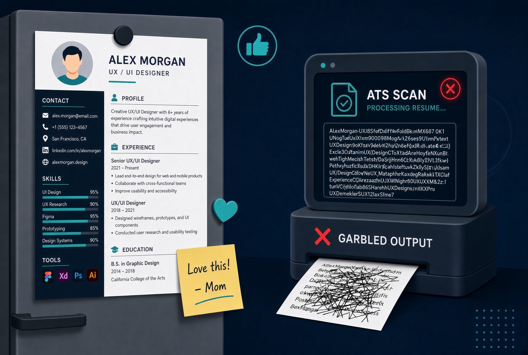 Your designer friend loved it. Your mom printed it out and put it on the fridge. You've gotten exactly one recruiter response in three months.
Sound familiar? There's a good chance your resume is a victim of its own good looks.
Here's the uncomfortable truth: most modern Applicant Tracking Systems don't "read" your resume the way a human does. They parse it, pulling raw text out of the file and dropping it into database fields. When your layout gets in the way of that process, the system doesn't flag it as pretty. It flags it as broken, or worse, it silently drops half your experience into a field labeled "unknown."
Let's go through the specific design choices that cause problems, system by system.
The Sidebar Problem (This One Is Huge)
The two-column resume with a colored sidebar is probably the most popular template on Canva, Etsy, and every resume marketplace right now. It looks clean and modern. It is also a parsing nightmare.
When an ATS reads a two-column layout, it doesn't see a left column and a right column. It reads left-to-right, line by line, across the entire page. So if your contact info is in the left sidebar and your work history is in the right column, the parser often interleaves them, producing something like:
Jane Smith Senior Marketing Manager jane@email.com Led demand generation for Acme Corp 555-123-4567 increasing pipeline by 40%...
That's your contact info and your job bullets mashed together into gibberish. Workday, Taleo, and iCIMS are all known to handle multi-column layouts poorly. Greenhouse is better, but it still struggles with heavily formatted files.
Skill Bars and Rating Graphs
Those little progress bars showing you're "85% proficient in Photoshop" or have four out of five stars in Python? The ATS sees nothing. Literally nothing.
Skill bars are almost always rendered as images or as spacing-based visual tricks that strip down to whitespace when parsed. The system doesn't extract "Photoshop 85%" as a skill. It may not extract "Photoshop" at all, depending on how the template is built.
The fix is simple: list your skills as plain text. A clean comma-separated list or a simple bulleted list is boring to look at and flawlessly parsed every time.
Icons Next to Your Contact Info
A little phone icon before your number. A LinkedIn bird before your URL. An envelope before your email. These are everywhere right now and they cause two specific problems.
First, many parsers read the icon as a character and attach it to your contact data, so your phone number becomes something like "▪ 555-123-4567" which may not match the system's expected format. Second, if the icons are embedded as image files, the entire contact block can get skipped.
Just write your phone number as a phone number. The recruiter will figure out what it is.
Text Boxes and Tables
Some templates use invisible tables or text boxes to create their layout. From a human perspective, these are invisible. From a parser's perspective, content inside a text box is often extracted last, completely out of sequence, or skipped entirely.
This is especially common in Microsoft Word templates that look simple but are secretly held together with a grid of table cells. If you didn't build your resume from scratch, it's worth checking how the file is actually structured.
Headers and Footers
Putting your name in the document header is a classic trick for keeping it visible on every page. Unfortunately, Taleo, in particular, is notorious for not reading document headers, which means the system may import your resume with no name attached. That's a rough start to any application.
Keep your name and contact info in the main body of the document, not in the header or footer.
How to Know If Your Resume Has These Problems
The frustrating part is that you can't tell any of this by looking at your resume. It looks fine as a PDF. It prints beautifully. The only way to know what an ATS actually extracts is to run it through a parser yourself.
That's exactly what the Audit the Bots tool on Past the Bots does. It shows you what different parsers actually pull out of your file: your name, contact details, work history, skills, and section labels. You can see in plain text what the system "sees," which makes the invisible problems suddenly very visible.
Once you know what's broken, the fix is usually straightforward: a clean single-column layout, plain-text skills, contact info in the body, and no decorative elements that rely on images or positioning.
The Bottom Line
Your resume doesn't need to be ugly. It needs to be readable by both a human and a machine. Those goals aren't in conflict, they just require knowing the rules.
Save the beautiful version for your portfolio. Send the clean version to the ATS. Then follow up like a human, because that's still what gets you in the door.